Monday, October 18, 2010
Ashley Hamm Fine Art
If you read my earlier post here, you saw our painting of Mont St. Michel by our friend, Ashley Hamm. I had the pleasure of visiting Ashley, her husband David, and their baby Blyss, in Shreveport this weekend. Ashley has been busy! While taking care of their 8 month old, she has found time to continue painting, including venturing into oils, and currently has a show in Shreveport. I only saw pictures of her new oil paintings (which you can find here), but they are breathtaking! What I wouldn't give to have one of those Koi paintings for my dining room. Did I mention that I just love orange these days? Ashley is immensely talented - it will be exciting to see what she comes up with next. Congratulations Ashley!
Thursday, October 7, 2010
Where have you been all my life?
A friend shared this blog with me last week and I just had to pass it along! I LOVE a good bargain. Seriously. It gives me a huge thrill when I feel like I am getting a good deal on something, whether it is clothes, furniture, decor, whatever. And when I am hunting for something in particular (like a rug lately), I keep thinking...I can find a better deal than this.
Well, here is a blog that has done the homework for me! Check it out. I am completely hooked.

Well, here is a blog that has done the homework for me! Check it out. I am completely hooked.
Monday, October 4, 2010
Stacie's House
Sorry for the silence...Sharon and I have both been busy, and I've been battling illnesses at my house. But, we are stockpiling ideas for posts and should have plenty more to add to the blog soon!
 Entryway - love the mix of wire, wood, wicker and pewter

Stacie said this upstairs loft/guest room is a work in progress. The orange accent wall is striking!
The bookshelf is from the Wisteria Outlet (a matching one faces it from the opposite wall). What my picture did not capture are these awesome sliding panels that Stacie created and added to give a guest some privacy at night.

Although it is difficult to tell from this picture, the ceiling in her sons' room is made of tin, and the walls are painted in rugby stripes of blue and green. The tin ceiling is such a fun addition to this little boy's bedroom! It's a little bit modern, a little bit urban, but works well with more traditional furniture too and helps create a space that is uniquely his.


Her daughter's nursery is newly finished. Here are a few pics of this beautiful mobile she made.


I was at my friend Stacie's house recently for dinner, and I just had to snap some pictures to share! Stacie has an amazing decorating sense, although she doesn't seem as aware of it as the rest of us are. She is quick to give credit to her sister, who helps her bring her projects to life. I've known Stacie since I was 11 and I can vouch for her creativity - it's fun to see how she expresses it in her house, and especially in her children's bedrooms (pictures below).
One of my favorite things about Stacie's house is her attention to detail. There are details everywhere in this house!

 |
| Stained glass hanging from entryway into kitchen |
 |
| Shelving above the entertain center - love that tree! |

Stacie said this upstairs loft/guest room is a work in progress. The orange accent wall is striking!
The bookshelf is from the Wisteria Outlet (a matching one faces it from the opposite wall). What my picture did not capture are these awesome sliding panels that Stacie created and added to give a guest some privacy at night.
 |
| Painted dresser from Wisteria Outlet, in the master bedroom |
 |
| Don't you just love these wood floors that Stacie and her husband installed? I am craving painted wood floors these days! |
 |
| A shelf high above the living room |
 |
 |
| More attention to detail... |


 |
| V putting her son's animals to sleep on top of a bookshelf. |
 |
 |
| Don't you think she should sell these on etsy??? Notice the felt leaves - so much detail. |
 |
| What little girl wouldn't sleep tight at night with her own moon and stars to watch? |

 |
| An adorable cover up for shelves in the nursery, sewn by Stacie's mom |
 |
| Love this mural! Again, made by Stacie. Is there nothing she can make??? |

 |
| Details, details. So sweet. |
 |
| A picket fence borders the nursery |
 |
| Peek a boo! |
Thank you Stacie for letting me post your house - sadly I don't think these pictures do it justice!
Friday, September 17, 2010
While we are on the subject...
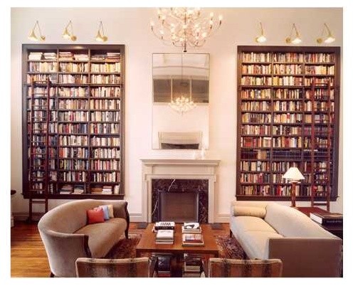
I thought I would post a few more pictures of bookshelves for a little inspiration! I may be obsessed with white bookshelves, but these stained shelves are gorgeous. The ladder is a nice touch, as well as the simple (but seriously tall) mirror above the fireplace.
This showcases some good ideas for how to arrange my bookshelves.
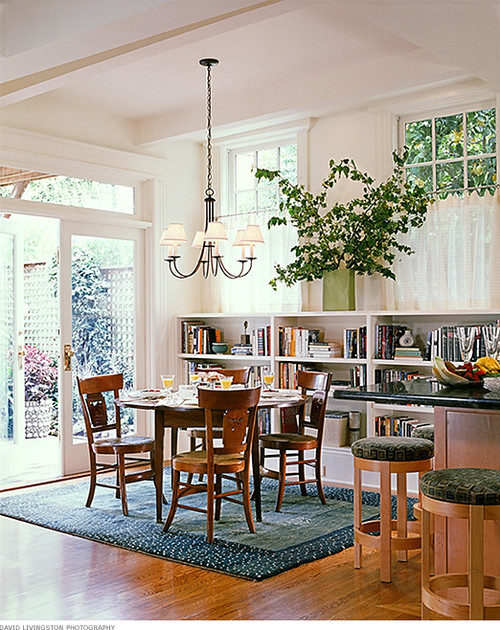
And don't get me started on how much I want painted hardwood floors right now...check out this combination of painted hardwoods and bookshelves.
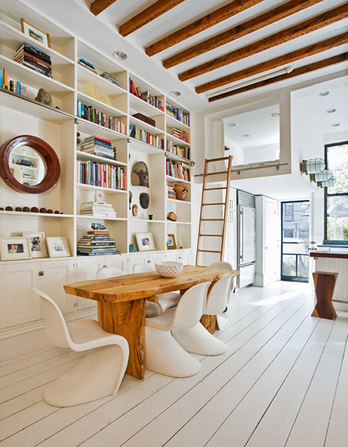
Covering books with paper makes me nostalgic for grade school and yet looks super sophisticated here. And once again, beadboard backing.
This showcases some good ideas for how to arrange my bookshelves.
contemporary dining room design by san francisco interior designer Michael Merrill Design Studio, Inc
And don't get me started on how much I want painted hardwood floors right now...check out this combination of painted hardwoods and bookshelves.
Covering books with paper makes me nostalgic for grade school and yet looks super sophisticated here. And once again, beadboard backing.
Beadboard bookshelves...sort of
I have always loved a nice set of white bookshelves - particularly the kind that take up an entire wall or flank a doorway. I have often thought of (dreamed of) adding white bookshelves to our dining room - either adding built ins that run on either side of our fire place or, in my more budget-conscious moments, just adding a couple of tall ready-made bookshelves. Then I saw THIS picture and fell in love with the beadboard backing on the bookshelves. I also loved the height of the bookshelves, which gives you a chance to display things at eye level and also hang pictures or photographs on the wall.

And it inspired me to create my own beadboard bookshelves, but on an Ikea kind of budget. I had already been eying the Billy bookcases at Ikea and based on my inspiration picture, decided to purchase two of the 41 3/4", 3 shelf version. B was kind enough to put them together for me!


There they are as just plain bookshelves, no backing. I have read a lot lately about how revolutionary paintable wallpaper is, including beadboard wallpaper. I ordered a roll of the Martha Stewart beadboard wallpaper from Home Depot, which luckily was more than enough to cover the back of the bookshelves and even leave room for error. After all, I don't know a thing about wallpaper - this would be my first time to install it. The wallpaper is an interesting texture - almost spongy, which I think helps give it the dimension to look more like real beadboard (and absorb paint, as you will see below).
Sharon, always willing to try a DIY project, came to my house on a Saturday to learn how to wallpaper. I had previously purchased wallpaper paste, a sponge and a knife from Home Depot. Reading the instructions on the roll of wallpaper, we set to work measuring, cutting and pasting the wallpaper to the flimsy cardboard backing that came with the bookshelves.
It took a bit of trial and error, but in the end we managed to cover the backing with only a slightly visible seam where we had to match strips of wallpaper. Unfortunately, what we did not account for was how heavy the wallpaper would be for that flimsy backing. The backing came tri-folded, and it just so happened that our seam ran along one of the folds. In little time the backing started buckling, bending, and eventually falling out of place.
Since we needed to wait at least a week before painting the wallpaper (according to mr. wallpaper expert at Home Depot), I decided to lay the backing down and stack heavy law books (might as well use them for something now) and cook books on top. In this picture I have the books on top of the wallpaper, but I quickly figured out this was leaving indents on the wallpaper and then flipped them over so the books were not applying direct pressure. I think the books helped only moderately.

Then came time to paint the wallpaper. I chose Relaxed Khaki from Sherwin Williams - I thought it would be a nice complement to the custom blue in our dining room, and I happened to have plenty of it to spare. It only took one coat to cover the wallpaper (score!). This project kept getting better! Time to install!

The backing was still bending and not staying in place - nothing a few nails couldn't fix. Once I had the backing where I wanted it, I secured it to the shelves by hammering several nails through the backing into the shelf. If you try this at home, be careful to make sure you are hammering into the shelf. I have to admit that I missed a few times.


Before decorating the bookcases, I followed the beautiful suggestion from Young House Love to fill the extra holes with Dap caulk. It took two tries before we found the right one that blended the best - the Dap Kwik Seal (bright white). It blends so well - unless you are up close, you really cannot notice.


So how do you like the final project? I haven't settled on how to decorate my new beadboard bookshelves, but I love them already; I think they add a lot of dimension to our dining room and give me a chance to showcase some color and texture that really stands out against the white of the shelves. I am thinking of adding another one to the right of the fire place - after all, I've got the supplies now. Any suggestions on what can make bookcases really pop?
Monday, September 6, 2010
something random
while partaking in my magazine obsession i noticed a home that had organized their books by the color of the spine. i thought this would be a fun and easy weekend project so yesterday while the boys napped i decided to reorganize that section of the built-ins. here is the final product.


Sunday, September 5, 2010
kitchens: what i have and like....what i want
my current kitchen isn't all that spectacular. there are a few areas that i love and features that i couldn't live without. i'll first show you my kitchen and the aforementioned spaces. then i will show you some photos of kitchens and ideas that i have fallen in love with and put in to my "idea book" for my dream house.
i love my dishwasher. it has a pull out tray at the VERY top that is for utensils. it is removable, so you can take it to the drawer for easy unloading. at the bottom of the dishwasher there is a handle and compartment that you can remove that catches all food from the dishes. i Miele did a great job with this feature. it's almost like a garbage disposal in your dishwasher!


for my ideal kitchen i am really all over the map! i know i want a few features. let's remember this is in my DREAM kitchen, most of which i am sure i may never see.
My dream kitchen is a mixture of the elements. It has brick, wood, steel, shiny industrial appliances and rustic worn furniture. Some features i would really like to have are refrigerated drawers, a pedal under my kitchen sink that turns the water on and off, an island with huge casters so it is more versatile, a warming drawer, a sonic ice machine, a pot filler on the cook-top back splash, and a huge pantry (see more below).
here are some pictures i have scavenged from the internet over the past few months. chances are my next house will need to have some updating done to it so i have started an ideas folder and throw pictures in there when i see something i love.
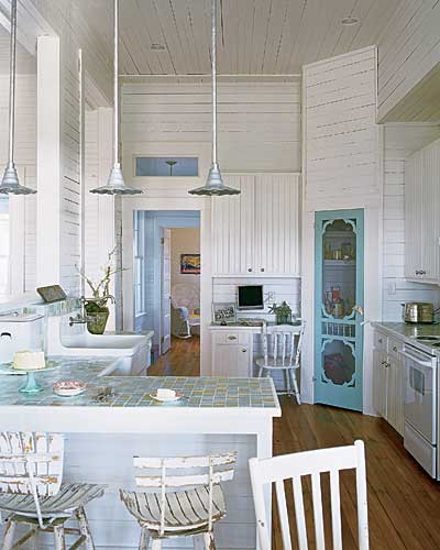
first kitchen picture shows the industrial range area i dream cooking meals in front of. i also love how the french doors in the distance are painted black, as is the trim around the kitchen sink. the only thing missing here is a pot filler at the range area of the kitchen.

this kitchen has the pot filler at the range area, but not quite the industrial look i love. however i LOVE the rustic table, old bench mixed with the air duct/warehouse looking fixtures on the ceiling as well as the
Q-bert-esque tiles on the floor.

this is the same kitchen as above. notice again the dark trimmed doors/windows as well as a mixture of old with new and crisp. love this.

this next picture features a screen door for the pantry! what a great idea. the kitchen still has clean lines, but that simple hint of whimsy seems to put the room at ease.
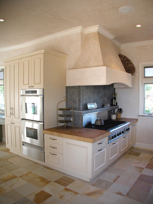

finally, while i am not a big fan of the cabinetry in this first kitchen, the brick archway, as well as the brick flooring in this kitchen brings me back to my acadian heritage. the kitchens in louisiana are second to none. i love the overall asthetic in these ktichens. here are two pictures of kitchens i love that incorporate brick. the second one really appeals to be because of the use of wood (columns and beams) as well.


i love my dishwasher. it has a pull out tray at the VERY top that is for utensils. it is removable, so you can take it to the drawer for easy unloading. at the bottom of the dishwasher there is a handle and compartment that you can remove that catches all food from the dishes. i Miele did a great job with this feature. it's almost like a garbage disposal in your dishwasher!


underneath the double ovens we have a drawer that is dedicated to kids stuff. plates, cups, sippys, snack traps. whatever. this way if they need a drink or a snack they can access their things without needing help. this is also an area that provides a lot of play time for clay and sam, as they love to unload this drawer.


on the side of the double ovens out of sight from the main kitchen area the previous owners had this mesh rack. each section is for a different family member. it works great for us and i really love that i have ONE area of my house that is a go to place for papers and what not.

i love my window above my sink.

and these prints from ikea above my bay window.
for my ideal kitchen i am really all over the map! i know i want a few features. let's remember this is in my DREAM kitchen, most of which i am sure i may never see.
My dream kitchen is a mixture of the elements. It has brick, wood, steel, shiny industrial appliances and rustic worn furniture. Some features i would really like to have are refrigerated drawers, a pedal under my kitchen sink that turns the water on and off, an island with huge casters so it is more versatile, a warming drawer, a sonic ice machine, a pot filler on the cook-top back splash, and a huge pantry (see more below).
here are some pictures i have scavenged from the internet over the past few months. chances are my next house will need to have some updating done to it so i have started an ideas folder and throw pictures in there when i see something i love.
first kitchen picture shows the industrial range area i dream cooking meals in front of. i also love how the french doors in the distance are painted black, as is the trim around the kitchen sink. the only thing missing here is a pot filler at the range area of the kitchen.

this kitchen has the pot filler at the range area, but not quite the industrial look i love. however i LOVE the rustic table, old bench mixed with the air duct/warehouse looking fixtures on the ceiling as well as the
Q-bert-esque tiles on the floor.

this is the same kitchen as above. notice again the dark trimmed doors/windows as well as a mixture of old with new and crisp. love this.

this next picture features a screen door for the pantry! what a great idea. the kitchen still has clean lines, but that simple hint of whimsy seems to put the room at ease.
i just like the placement of this cook-top as well as the butcher block counter tops in that area.
this is the picture i have been dying to post. i searched and searched for a cool, never-before-seen idea for a kitchen to use on this post specifically. i LOVE this idea for a pantry. they have a nice walk in pantry, but the kicker is that they've located the FRIDGE in the pantry! what a concept!!!!!!!!! i love this love love love this....

finally, while i am not a big fan of the cabinetry in this first kitchen, the brick archway, as well as the brick flooring in this kitchen brings me back to my acadian heritage. the kitchens in louisiana are second to none. i love the overall asthetic in these ktichens. here are two pictures of kitchens i love that incorporate brick. the second one really appeals to be because of the use of wood (columns and beams) as well.


Subscribe to:
Posts (Atom)